Our Blog
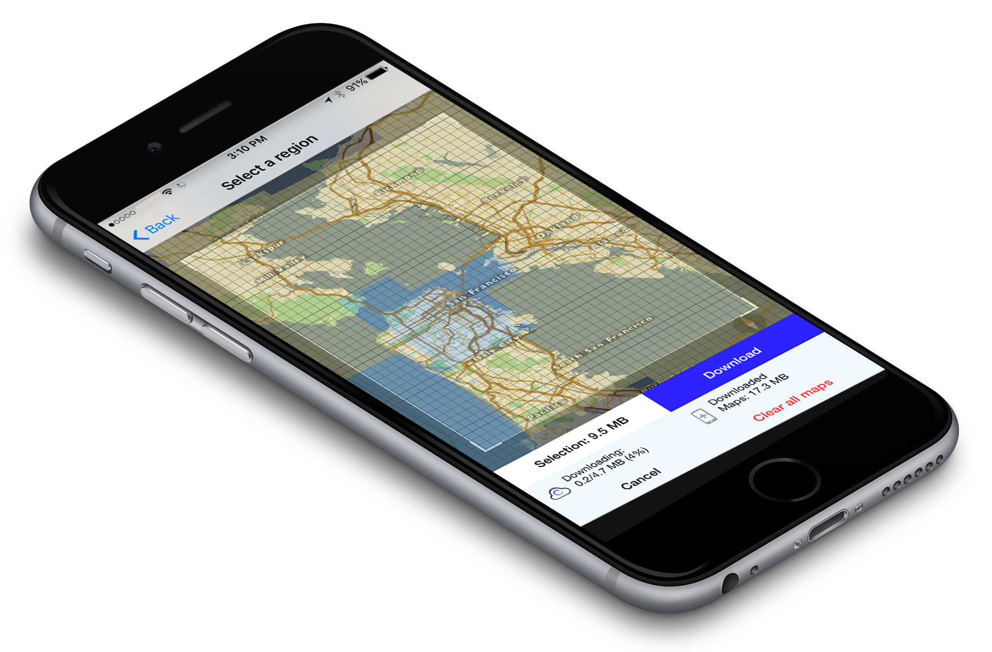
 For the past couple of months we have been experimenting with a new design for the offline maps download manager. The idea was to create a UI that was so easy and understandable that non-tech users would know immediately how to use it. After a couple of different iterations and tests, we came to a version which was in-line with the simple usability of our other features. When the user selects “offline maps” they are taken to a overlay of the map. It shows a field of view which can be manipulated completely. Both the size of view and the zoom level of the region that needs to be downloaded, are malleable. This is coupled with a technology that labels downloaded areas blue and un-dowloaded areas yellow. If the user questions whether they have already downloaded a certain map region, all they have to do is see if it is blue. It is a simple feature, but we believe, very useful for usability. An improved user-interface and a few simple features makes the user-experience of the new offline maps manager second to none. It enhances the experience of the whole app and makes the user comfortable where ever they are.
