Category: Release
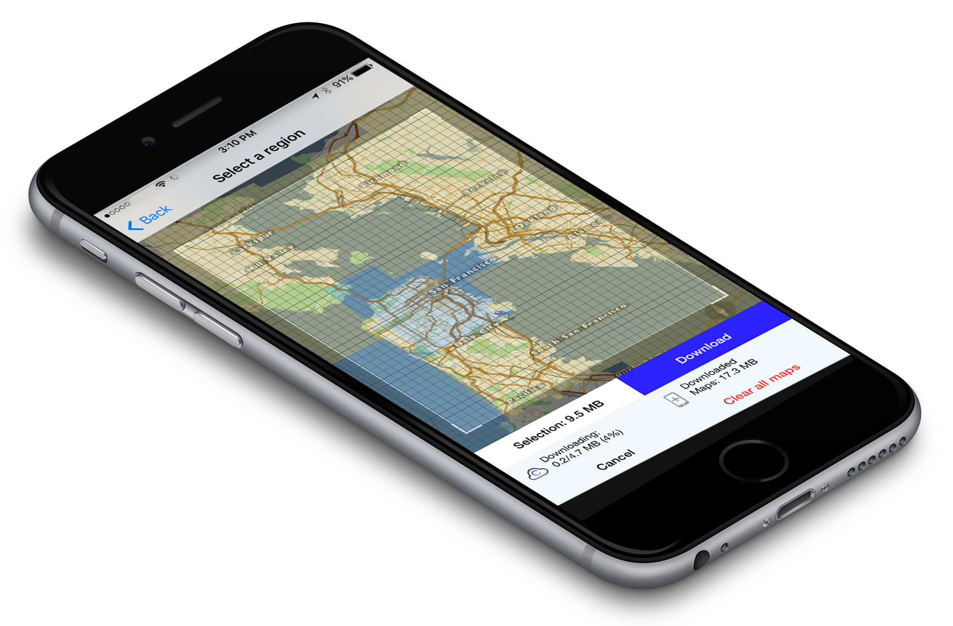 For the past couple of months we have been experimenting with a new design for the offline maps download manager. The idea was to create a UI that was so easy and understandable that non-tech users would know immediately how to use it. After a couple of different iterations and tests, we came to a version which was in-line with the simple usability of our other features. When the user selects “offline maps” they are taken to a overlay of the map. It shows a field of view which can be manipulated completely. Both the size of view and the zoom level of the region that needs to be downloaded, are malleable. This is coupled with a technology that labels downloaded areas blue and un-dowloaded areas yellow. If the user questions whether they have already downloaded a certain map region, all they have to do is see if it is blue. It is a simple feature, but we believe, very useful for usability. An improved user-interface and a few simple features makes the user-experience of the new offline maps manager second to none. It enhances the experience of the whole app and makes the user comfortable where ever they are.
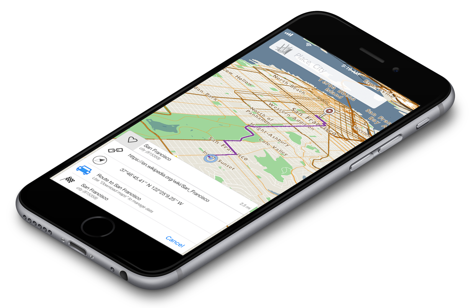
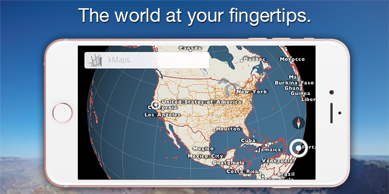
After more than a year of reworking different aspects of our maps, a new product is now ready. Since the last release, we decided to buckle down and really listen to our customer feedback to make the maps more functional and beautiful. With this new release we aimed to create a solid foundation to build new features quickly for our users. The goal is to now release a new build every 3-4 weeks with exciting features and fixes. This foundational build offers vivid 3D maps with the ability to manipulate the field of view to whichever angle you need, which is a precursor to our introduction of online/offline navigation and directions. We have also re-imagined the user-interface to make it easy for anyone to use. Our UI upgrades are coupled with a favorites feature that is linked to our redesigned search engine. Enjoy downloading our app online or offline for free and download any size region for future use with our simple download manager. Please don’t hesitate to give us your feedback.
Our new release is out and we’ve implemented many things which you have told us are very important. Thank you for making our application better and for pointing out our mistakes. Keep doing what you do, we love it and appreciate it.
Some quick technical updates for you:
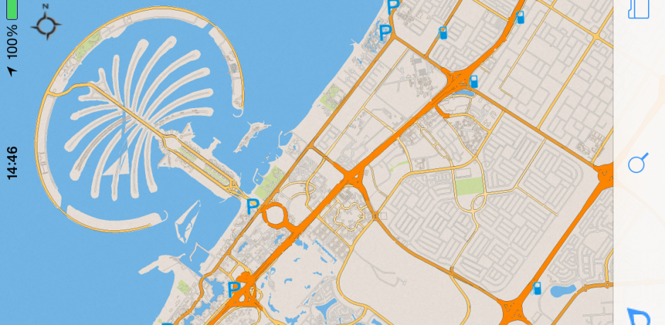
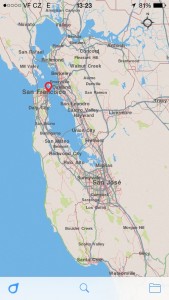
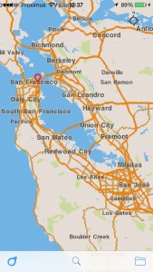
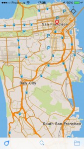
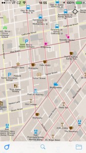
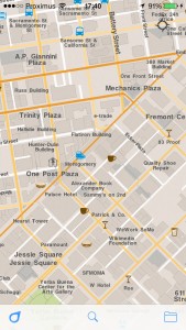
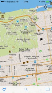
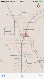
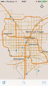
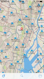
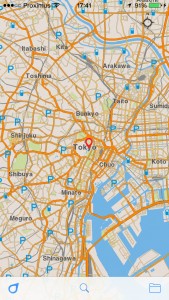
The main visual differences is: new style and prioritized POIs(points of interest) on the map. Also a map projection was fixed.
| Before | Now |
| Style | |
 |
  |
| Points of Interest | |
 |
  |
| The projection fixes | |
 |
 |
| Tokyo | |
 |
 |
We also fixed some maps for Africa.
Again, your feedback is very important to us. Every piece of feedback goes straight back into helping improve the next version.
Install/Update kMaps now, share your experiences and impressions with your friends, and don’t hesitate to review the app on the AppStore or send some feedback to support@kmaps.co
We would like to give a special thanks to Ralph Hill, Abel La O Fernandez and Bonnie MacPherson. You have contributed great feedback which has lead to this improved this release. Thanks!
We have been 6 months silent after first version, which is quite long, but in that time we’ve done a lot.
First we would like to say thanks to those of you who gave us feedback and for helping to determine our priorities. Input is very important, especially when resources are very limited.
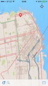
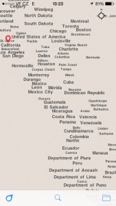
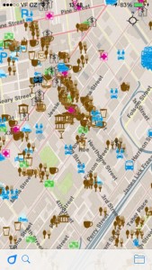
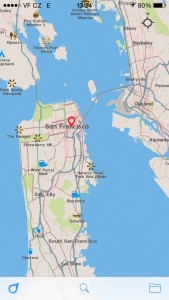
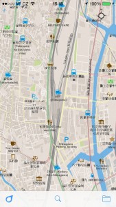
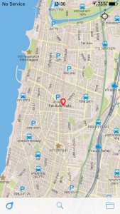
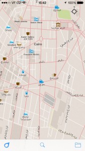
The main visual differences in this version, compared to the previous version, are: retina display, prioritize POI on the map, far zoom for map rendering and unlimited zoom for titles, uncrossed titles, name of cities and countries, support Arabic and Hebrew, tons of optimization.
| Before | Now |
| Max zoom | |
 |
  |
| POIs | |
 |
  |
| Tokyo | |
 |
  |
| Hebrew and Arabic | |
 |
  |
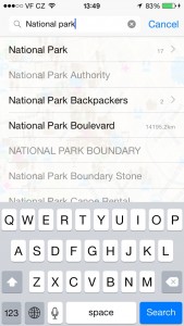
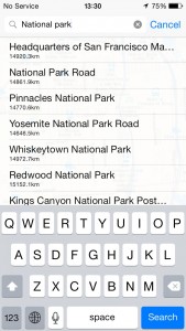
As you may have noticed, the first version supported only elementary search by specific titles. It was possible to find something, but it didn’t support much. Now we support search by city, country, or partial words and list multi-pin results on the map. The app also supports searching with accented words or to comfortably search without them. The search shows a result based on current map view. So, if you need to find something in other city you will need to move there first.
| Before | Now |
| Search by city or country | |
| Not available | 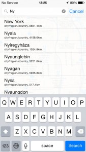 |
| Search by particular words | |
 |
 |
| Multi-pin search result | |
| Not available | 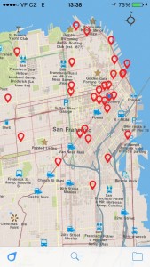 |
The user interface has been improved as well. Now you have the option to filter your downloaded maps and use gestures, like one finger zoom in/out. Which can be done by holding one finger on the map for a bit and then use a swiping motion upward or downward.
We also built more maps for Africa!
Again, your feedback is very important to us. It helps us focus on your real needs and problems. Every piece of feedback goes straight back into helping improve the next version. So, without your voices contributing to our development, this project wouldn’t be a possibility.
Install/Update kMaps now, share your experiences and impressions with your friends, and don’t hesitate to review the app on the AppStore or send some feedback to support@kmaps.co
Thanks!
